
Understanding Color Psychology in Painting your Interior Rooms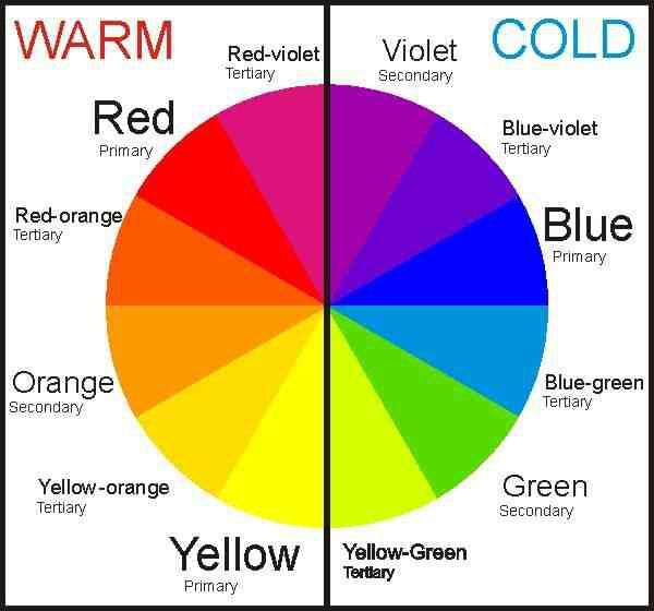 Color psychology is the study of how colors can influence human behavior and emotions. In choosing paint colors for your interior paint project, understanding color psychology plays a crucial role in creating the desired ambiance in a space. Here are a few key points to consider:
Factors to Consider When Choosing Paint Colors When choosing paint colors, consider factors like the room's natural light, the size of the space, and the mood you want to create. Remember that different colors can affect the room's ambiance - cool colors like blues and greens can create a calming atmosphere, while warm colors like reds and yellows can make a room feel cozy. Think about how you want the room to feel when choosing your paint colors. How Lighting Affects Color Perception Natural light in a room can change how colors look. Light intensity and direction affect how we see colors. For example, warm lighting can make colors look cozy, while cool lighting can make them appear fresh. When painting a room, consider how the lighting will impact your color choices. Tips for Selecting the Perfect Paint Color When selecting a paint color, consider the lighting in the room. Natural light can alter the way a color looks. Opt for sample swatches to test colors on the walls before committing. Bold colors can make a room feel cozy, while light colors can create an airy atmosphere. If you're unsure, neutral tones are versatile and easy to work with. Utilizing Color Swatches and Samples When selecting colors for your next living room painting project, it's essential to utilize color swatches and samples. These tools allow you to test different shades and see how they look in your space before committing to a color. By comparing various options, you can ensure that the final result matches your vision and complements your decor. Remember, the lighting in your room can affect how colors appear, so it's helpful to view swatches in different lighting conditions to make an informed decision. Working with a Color Consultation When working with these experts, they will consider factors like natural light, room size, and your personal preferences to suggest the most suitable colors that will enhance the look and feel of your space. Their consultation ensures that you make confident color choices that complement your style and overall design aesthetic. The Importance of Color Coordination in Interior Design Color coordination is crucial in interior design as it sets the mood and atmosphere of a room. Well-coordinated colors can make a space feel cohesive and visually appealing, while clashing colors can create a sense of discordance. Consider the following:
Tricks to Enhance Small Spaces with Color When enhancing small spaces with color, consider using lighter and softer hues to create a sense of airiness and openness. Light colors reflect light, making a space feel larger, while soft colors add a cozy atmosphere. Avoid dark colors as they can make a room feel more confined. To add depth without overwhelming the space, incorporate accent colors strategically. Mirrors can also help create the illusion of a larger area by reflecting light and colors around the room. Trending Color Schemes for your Interior Living Spaces When it comes to choosing the right colors for your interior painting project, staying updated with the latest trends in color schemes can give your space a fresh and modern look. Some of the trending color schemes in painting your interior living room and interior bedrooms currently include soft pastels like blush pink and dusty blue, earthy tones such as terracotta and sage green, and bold jewel tones like emerald green and sapphire blue. Incorporating these trending color schemes can help you create a stylish and inviting ambiance in your living space. Final Touches and Finishing Details When it comes to final touches and finishing details in painting, it's essential to pay attention to the small things that can make a big difference in the overall look of your project. To achieve a professional finish, focus on details like cleaning up any smudges or drips, making sure edges are crisp and sharp, and using the right tools for touch-ups. Don't rush this stage, as taking the time to perfect these final touches can elevate the quality of your paint job. WHEN LOOKING FOR PROFESSIONAL HELP FOR YOUR INTERIOR PAINTING PROJECT, PARADISE PAINTING CAN HELP. WE PROVIDE INTERIOR PAINTING SERVICES IN GRAND BLANC, MI, AND SURROUNDING AREAS. SUCH AS BURTON, SWARTZ CREEK, AUBURN HILLS, LAKE ORION, CLARKSTON, FLUSHING, MI. CALL US TODAY AT 810-371-3644 FOR A FREE PAINTING ESTIMATE. Simple Painting Tips to do in the Spring Before Painting  As winter bids farewell and spring eagerly approaches, homeowners prepare for the seasonal shift. Beyond the melodies of chirping birds and the promise of budding blooms, spring beckons with a call to tend to neglected exterior chores, long overlooked during the colder months.
While spring cleaning may not rank high on everyone's list of preferred activities, attending to your home's exterior paint can significantly enhance both its value and visual appeal. However, achieving optimal results requires careful execution – from selecting the right paint to mastering the timing. Here, we've curated our top spring house-painting tips to empower you to elevate your home to new heights. Stay Weather-Wise: Exterior painting introduces a crucial factor: Weather. Rain poses a threat to unpainted or unprotected surfaces, while humidity can impact paint application and drying. It's imperative to acquaint yourself with the forecast before embarking on your painting journey. Aim for moderate temperatures, avoiding extremes of heat or cold, and seek a clear window devoid of rain or adverse weather conditions. By aligning your painting efforts with favorable weather conditions, you can ensure a smooth and successful project, bringing renewed vibrancy to your home's exterior this spring. What You Need To Do: Before embarking on your exterior painting project, it's essential to have a clear understanding of the tasks at hand. Take stock of your home's condition by conducting a thorough assessment, focusing on the following areas: 1. Exterior Inspection: Survey the exterior of your home for signs of wear and tear, such as peeling paint or cracks. These issues can lead to moisture penetration and subsequent rot, necessitating timely repairs before painting can commence. Additionally, be vigilant for any indications of termite or pest activity. Hollow sounds or visible infestations warrant immediate attention from a professional exterminator. 2. Windows and Doors Examination: Inspect windows and doors for air leaks and cracks that could compromise the integrity of your paint job. Seal any gaps with caulk to prevent paint from seeping into these vulnerable areas. Be on the lookout for discarded termite wings near window sills, as they may indicate an infestation requiring treatment. 3. Wood Deck Assessment: Evaluate the condition of your wood deck, paying close attention to any cracks, chips, or peeling paint. Winter weather fluctuations can cause nails to protrude, posing safety hazards. Secure any loose nails with a hammer and address any significant structural issues promptly to ensure the deck's stability and longevity. By conducting a comprehensive assessment and addressing any underlying issues proactively, you can lay the groundwork for a successful exterior painting project that enhances your home's beauty and durability for years to come. Don’t Forget To Properly Prep: Ensuring proper preparation is crucial to achieving a flawless exterior paint job. Once you've addressed any structural issues and assessed your home's condition, it's time to undertake thorough preparation steps: 1. Clean the surface: Begin by thoroughly cleaning the exterior surfaces to remove dirt, grime, and any remnants of old paint. While pressure washing is effective, be cautious as it can damage certain exterior materials. Research the recommended cleaning method for your specific exterior type to ensure optimal results. 2. Sand the surface: Prior to painting, sanding the exterior surfaces is essential to create a smooth, uniform substrate for the new paint. This process removes bumps, imperfections, and old paint residue, enhancing adhesion and ensuring a professional finish. Additionally, sanding provides the surface with better "grip," facilitating paint adherence. Once you've completed these preparatory steps, it's time to consider your painting options. Whether you choose to enlist professional painters or embark on a DIY painting project, thorough preparation sets the stage for a successful and long-lasting exterior transformation. WHEN LOOKING FOR PROFESSIONAL HELP FOR YOUR EXTERIOR PAINTING PROJECT, PARADISE PAINTING CAN HELP. WE PROVIDE RESIDENTIAL AND COMMERCIAL PAINTING SERVICES IN GRAND BLANC, MI, AND SURROUNDING AREAS. SUCH AS BURTON, SWARTZ CREEK, AUBURN HILLS, LAKE ORION, CLARKSTON, FLUSHING, MI. CALL US TODAY AT 810-371-3644 FOR A FREE PAINTING ESTIMATE Understanding the Impact of Paint RenovationFresh paint can significantly increase your property's value by providing a more attractive and updated appearance. According to a study by Zillow, homes with light blue bathrooms, light taupe living rooms, and light cerulean blue kitchens sold for more money. Additionally, using neutral colors, such as beige or light gray, can make your property more appealing to potential buyers. Moreover, a well-done paint job can also enhance the perceived quality of your property, making it more desirable compared to other similar properties. 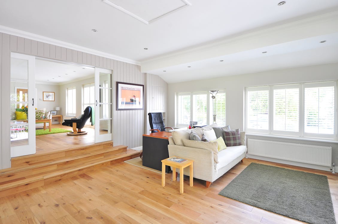 Ways paint renovation can increase property value
Fresh paint can significantly increase your property's value by making it look newer and more appealing to potential buyers. Here are a few ways in which paint renovation can enhance your property value:
Selecting the right color scheme for property enhancement Choosing the right color scheme for your property's renovation can significantly impact its value. Research suggests that certain colors can attract potential buyers and make your property more appealing. Consider using neutral colors like gray, beige, or white for a clean and versatile look. Bold colors like navy or forest green can also create a modern and luxurious feel. Keep in mind that the color palette should complement your property's architectural style and surroundings to enhance its overall aesthetic appeal. Preparing for a paint renovation project Before starting a paint renovation project, it's important to consider a few key steps to ensure it's done effectively. Here are some tips to help you prepare:
Hiring professional painters for the job Professional painters can significantly increase the value of your property. They have the skills to ensure a high-quality finish that can attract potential buyers. Additionally, professional painters have access to a wide range of paint options and techniques that can enhance the overall aesthetics of your property. Hiring professional painters may involve an initial cost, but it can lead to a higher return on investment when selling your property. DIY paint renovation tips and tricks If you're considering a DIY paint renovation to boost your property value, there are a few tips and tricks to keep in mind. Here are some key points to consider:
Choosing the best type of paint for maximum impact When choosing the best type of paint for maximum impact on your property's value, consider the following:
Assessing the ROI of paint renovation When considering the return on investment for paint renovation, it's important to understand that a fresh coat of paint can significantly increase your property value. According to a study by Zillow, homes with a fresh paint job in neutral colors tend to sell for more money. In fact, the National Association of Realtors estimates that repainting the interior of your home can yield a 1-3% increase in property value. Furthermore, exterior paint can provide an even higher return on investment, with some estimates suggesting an ROI of 140%. Remember, the key is to choose neutral colors that appeal to a wide range of potential buyers. Showcasing before and after transformations If you want to increase the value of your property, a paint renovation can be the perfect solution. Showcasing before and after transformations of paint renovations can help potential buyers or renters visualize the potential of the property. By demonstrating the impact of a fresh coat of paint on the walls, doors, and trims, you can highlight the overall improvement in the appearance of your property. This can make a significant difference in attracting potential buyers or renters and can increase the perceived value of your property. Final thoughts on maximizing property value through paint renovation When considering paint renovation as a way to increase your property value, keep in mind that the color and quality of the paint can make a significant difference. A fresh coat of paint can enhance the curb appeal and overall aesthetic of your property, potentially attracting more potential buyers or tenants. It's important to choose neutral and appealing colors that have broad market appeal. Additionally, don't overlook the importance of proper preparation and application to ensure a professional finish. Ultimately, investing in paint renovation can be a cost-effective way to improve your property's value and make it more appealing to potential buyers or renters. WHEN LOOKING FOR PROFESSIONAL HELP FOR YOUR EXTERIOR PAINTING PROJECT, PARADISE PAINTING CAN HELP. WE PROVIDE RESIDENTIAL AND COMMERCIAL PAINTING SERVICES IN GRAND BLANC, MI, AND SURROUNDING AREAS. SUCH AS BURTON, SWARTZ CREEK, AUBURN HILLS, LAKE ORION, CLARKSTON, FLUSHING, MI. CALL US TODAY AT 810-371-3644 FOR A FREE PAINTING ESTIMATE. The Importance of Exterior Painting for Enhancing Property Value and Protection In the realm of homeownership, maintaining the exterior of your property is just as crucial as attending to its interior. While many focus on interior renovations and decor, neglecting the exterior can diminish the overall appeal and value of your home. One of the most effective ways to enhance both the aesthetics and durability of your property is through exterior painting. Let's delve into the significance of this often overlooked aspect of home maintenance.
Curb Appeal: Aesthetic Allure Beyond the Surface First impressions matter, and when it comes to homes, curb appeal plays a pivotal role. Exterior painting serves as the visual façade of your property, setting the tone for what lies within. A freshly painted exterior immediately grabs attention, exuding charm, and elegance. Vibrant hues can evoke warmth and welcome, while modern color palettes can portray sophistication and style. Moreover, a well-maintained exterior speaks volumes about the care and attention given to the property as a whole. It creates an inviting ambiance, enticing both residents and visitors alike. Whether you're looking to sell your home or simply take pride in its appearance, enhancing curb appeal through exterior painting is a worthwhile investment. Weather Protection: Shielding Your Investment Beyond aesthetics, exterior painting serves as a protective barrier against the elements. From scorching sun rays to torrential rains and snowstorms, your home's exterior is constantly exposed to various weather conditions. Quality paint acts as a shield, safeguarding your property from moisture, UV rays, mold, mildew, and even pests. Properly applied paint forms a waterproof seal, preventing water infiltration and subsequent damage such as rotting wood or cracking surfaces. This proactive measure extends the lifespan of your exterior surfaces, saving you from costly repairs down the line. By fortifying your home against nature's wrath, exterior painting ensures longevity and durability, thus preserving your investment for years to come. Exterior Maintenance: A Preventive Approach Regular exterior painting is an integral part of ongoing maintenance for any property. It allows homeowners to address minor imperfections before they escalate into major issues. Surface preparation, including cleaning, sanding, and priming, is key to achieving a flawless finish and ensuring the paint adheres properly. Moreover, painting provides an opportunity to inspect the exterior for any signs of wear and tear, such as cracks, peeling paint, or insect damage. By identifying and rectifying these issues early on, you can prevent further deterioration and maintain the structural integrity of your home. Property Value: Investing in Long-Term Appreciation Perhaps one of the most compelling reasons to prioritize exterior painting is its direct impact on property value. A well-maintained exterior significantly enhances the perceived worth of your home, making it more attractive to potential buyers should you decide to sell in the future. Studies have shown that properties with freshly painted exteriors tend to sell faster and command higher prices than their neglected counterparts. Prospective buyers are willing to pay a premium for homes that exude curb appeal and require minimal immediate maintenance. Therefore, by investing in exterior painting, you're not only enhancing the present enjoyment of your home but also securing its long-term appreciation in value. In conclusion, exterior painting is not merely a cosmetic endeavor but a strategic investment in the overall well-being and value of your property. From boosting curb appeal and weather protection to facilitating exterior maintenance and increasing property value, its significance cannot be overstated. So, whether you're aiming to refresh the look of your home or fortify it against the elements, consider the transformative power of a fresh coat of paint. After all, the beauty truly lies in the details, and the exterior of your home is no exception. WHEN LOOKING FOR PROFESSIONAL HELP FOR YOUR EXTERIOR PAINTING PROJECT, PARADISE PAINTING CAN HELP. WE PROVIDE RESIDENTIAL AND COMMERCIAL PAINTING SERVICES IN GRAND BLANC, MI, AND SURROUNDING AREAS. SUCH AS BURTON, SWARTZ CREEK, AUBURN HILLS, LAKE ORION, CLARKSTON, FLUSHING, MI. CALL US TODAY AT 810-371-3644 FOR A FREE PAINTING ESTIMATE. Color of the Year 2024 and Trending Paint Colors The year 2024 brings with it a fresh wave of design trends, and one of the most influential aspects is the choice of paint colors for interiors and exteriors. Homeowners and designers alike are seeking innovative ways to infuse personality and style into living spaces. In this article, we'll explore the trending interior and exterior paint colors for 2024, capturing the essence of the year's design spirit.
Let us start off with Pantone's 2024 new color: Meet Pantone's cool new color for 2024 – it's called "Peach Fuzz"! Imagine the juiciest, yummiest peach you've ever seen – that's the color! It's like a warm hug for your room, making it super cozy and fun. Whether you want to paint a wall or add it to your furniture, Peach Fuzz brings a happy vibe to your space. It's like having a little bit of sunshine indoors. So, if you want your room to feel like a comfy, peachy paradise, Peach Fuzz is the way to go! 🍑✨ Trending Interior Paint Colors:
Trending Exterior Paint Colors:
As we navigate through 2024, the world of interior and exterior paint colors reflects a diverse and dynamic spectrum. From warm and grounding terracottas to modern grays and coastal blues, homeowners have an array of options to infuse their living spaces with style and personality. Whether you prefer the timeless appeal of neutrals or the bold statements of rich hues, 2024 invites you to explore and experiment, transforming your home into a canvas of self-expression. Embrace the trends, trust your instincts, and let your living spaces tell a story that is uniquely yours. WHEN LOOKING FOR PROFESSIONAL HELP FOR YOUR INTERIOR PAINTING PROJECT, PARADISE PAINTING CAN HELP. WE PROVIDE INTERIOR PAINTING SERVICES IN GRAND BLANC, MI, AND SURROUNDING AREAS. SUCH AS BURTON, SWARTZ CREEK, AUBURN HILLS, LAKE ORION, CLARKSTON, FLUSHING, MI. CALL US TODAY AT 810-371-3644 FOR A FREE PAINTING ESTIMATE. Home Interior Painting Ideas for the Holiday Season Photo Courtesy: Ballard Designs The holiday season is upon us, and what better way to embrace the festive spirit than by giving your home a fresh new look with a winter-inspired interior painting project? Whether you're aiming for a cozy cabin retreat or a glamorous winter wonderland, we've got you covered. In this article, we will explore some creative home interior painting ideas that will help you transform your space into a magical holiday haven.
As the vibrant colors of summer start to give way to the warm and cozy hues of fall in Grand Blanc, Michigan, it's time to start thinking about home maintenance. Fall is a crucial season to ensure that your home remains comfortable, energy-efficient, and safe throughout the upcoming colder months. To help you get started, we've put together a list of essential fall home maintenance tips tailored to the unique needs of homeowners in Grand Blanc. Check Your Heating System: Before the cold sets in, schedule a professional inspection of your heating system. A well-maintained furnace will not only keep your home warm but also operate efficiently, potentially saving you money on energy bills. Don't forget to change your furnace filter regularly throughout the season to improve air quality and system performance. Seal Windows and Doors: Inspect your windows and doors for drafts. Apply weatherstripping or caulk where needed to prevent cold air from infiltrating your home. Proper insulation can make a significant difference in your heating bills and overall comfort. Clean Gutters and Downspouts: Fall brings leaves and debris that can quickly clog gutters and downspouts. Ensure that water can flow freely by cleaning them out. Clogged gutters can lead to water damage, which is especially problematic in the rainy fall season. Roof Inspection: Have your roof inspected for damaged or missing shingles. A small roof issue can become a significant problem during winter when snow and ice accumulate. Addressing roof repairs now can prevent costly damage later. Lawn and Garden Maintenance: Prepare your lawn and garden for winter by removing dead vegetation, trimming trees, and raking leaves. Properly store gardening tools, fertilizers, and hoses, and consider planting fall-appropriate bulbs for a beautiful spring garden. Chimney Cleaning and Inspection: If you have a fireplace or wood-burning stove, schedule a professional chimney sweep and inspection. Creosote buildup can cause short term and long term issues, so it's crucial to keep your chimney clean and safe. Exterior Inspection: Walk around your home's exterior to look for cracks, gaps, or holes in the siding or foundation. Seal any openings to keep out pests and prevent heat loss. Also, consider power washing your home's exterior to remove dirt and grime. Inspect Smoke and Carbon Monoxide Detectors: With windows closed during the fall and winter, it's essential to ensure your smoke and carbon monoxide detectors are in working order. Change the batteries and test them to guarantee your family's safety. Service Your Lawn Equipment: Before storing your lawnmower and other outdoor equipment for the winter, clean them thoroughly, change the oil, and add fuel stabilizer. Proper maintenance now will ensure they start up smoothly next spring. Prepare for Winter Storms: Stock up on essential supplies like rock salt, snow shovels, and ice melt. Be ready for winter storms, which can be unpredictable in Grand Blanc, by having emergency supplies and a generator on hand if needed. Schedule a Professional Home Inspection:
Consider scheduling a comprehensive home inspection by a qualified professional. They can identify potential issues you might have missed and provide recommendations for preventive maintenance. In Grand Blanc, Michigan, preparing your home for fall and winter is not just about comfort but also about safeguarding your investment. By taking these proactive steps, you can enjoy a cozy, worry-free autumn and winter season in your Grand Blanc home. 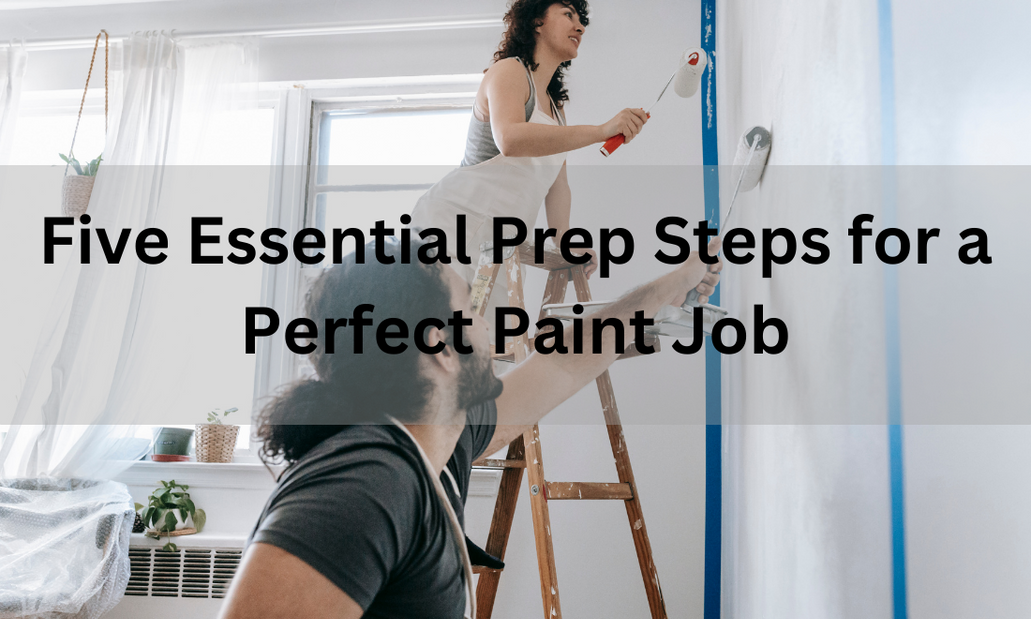 A well-executed paint job can transform the look and feel of a space, but the key to achieving a flawless finish lies in the preparation. In this article, we will explore the five essential prep steps that are crucial for a perfect paint job. These steps set the stage for a professional-quality outcome that will leave your surfaces looking impeccable.
Step 1: Surface Assessment Before you dip your brush into that beautiful paint color you've chosen, it's essential to assess the condition of the surface you'll be painting. This involves a careful examination to identify imperfections, damage, and any underlying issues that need attention. Think of it as creating a clean and smooth canvas for your paint to adhere to seamlessly. Step 2: Surface Preparation Surface preparation is where the magic begins. Once you've assessed the condition, it's time to roll up your sleeves and get to work. Start by thoroughly cleaning and dusting the surface to ensure there are no contaminants that could affect adhesion. Next, sand and smooth any rough areas, creating an even texture for the paint to glide over. Don't forget to fill cracks, holes, and gaps with suitable materials, ensuring a uniform surface. Step 3: Masking and Taping To achieve clean lines and edges, it's crucial to protect adjacent surfaces and areas that you don't want to paint. This step involves masking and taping with precision. Choosing the right masking materials and applying tape meticulously is key. It's a meticulous process, but the results are well worth the effort. Clean lines and sharp edges make a significant difference in the final outcome. Step 4: Priming Priming is a critical step that often gets overlooked. It serves as the bridge between your surface and the final paint layer, enhancing adhesion and durability. Choosing the right primer for your specific surface is essential. Apply it evenly and allow it to dry properly before moving on to painting. Proper primer application ensures that your paint adheres evenly and lasts longer. Step 5: Ventilation and Safety Lastly, don't overlook the importance of proper ventilation and safety during your painting project. Adequate ventilation ensures that fumes disperse safely, reducing health risks. Additionally, always take necessary safety precautions and wear appropriate gear, such as respirators and eye protection. Creating a safe and healthy working environment is essential for both you and your project. In conclusion, the quality of your paint job is directly tied to the thoroughness of your preparation. By following these five essential prep steps, you can achieve professional-quality results that will leave your surfaces looking flawless. Remember that the effort you invest in preparation will be reflected in the beauty and longevity of your paint job. So, roll up your sleeves, take your time, and enjoy the satisfying transformation of your space. WHEN LOOKING FOR PROFESSIONAL HELP FOR YOUR INTERIOR PAINTING PROJECT, PARADISE PAINTING CAN HELP. WE PROVIDE INTERIOR PAINTING SERVICES IN GRAND BLANC, MI, AND SURROUNDING AREAS. SUCH AS BURTON, SWARTZ CREEK, AUBURN HILLS, LAKE ORION, CLARKSTON, FLUSHING, MI. CALL US TODAY AT 810-371-3644 FOR A FREE PAINTING ESTIMATE. 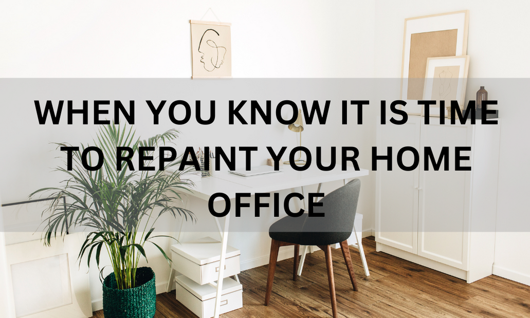 Recognizing the need for a fresh paint job in your home office is essential to maintain a productive and appealing workspace. Here are indicators that it's time to repaint your home office in Rochester, MI.
1. Dull or Faded Walls: When your once-vibrant walls appear lackluster or discolored, it's a clear sign that repainting is necessary. Sunlight exposure, dirt accumulation, and subpar paint quality can contribute to this issue. Investing in quality paint and following standard painting procedures will ensure long-lasting vibrancy. 2. Peeling or Cracked Paint: Peeling or cracked paint on various surfaces indicates an urgent need for repainting. Ignoring this problem may lead to more extensive damage over time. Repairing these areas restores the appearance and protects your office walls from further deterioration. 3. Stains or Scuff Marks: Accidents leave behind stubborn stains, scuff marks, and even physical damage on your office walls. If these imperfections affect the professional look of your workspace, repainting becomes a convenient solution. Heavier stains that are more persistent to clean require a fresh coat of primer and a top coat of paint to conceal effectively. 4. Repurpose or Redesign: If you've recently altered a room's function or your home office's design, repainting can help solidify the transformation. Updating the color scheme to align with the new purpose of your workspace enhances productivity and creates a supportive environment. However, consider the existing lighting, as it significantly affects how your chosen paint color will appear in the space. In conclusion, watching for these signs will help determine when to repaint your home office, ensuring a well-maintained and aesthetically pleasing work environment. WHEN LOOKING FOR PROFESSIONAL HELP FOR YOUR INTERIOR PAINTING PROJECT, PARADISE PAINTING CAN HELP. WE PROVIDE INTERIOR PAINTING SERVICES IN GRAND BLANC, MI, AND SURROUNDING AREAS. SUCH AS BURTON, SWARTZ CREEK, AUBURN HILLS, LAKE ORION, CLARKSTON, FLUSHING, MI. CALL US TODAY AT 810-371-3644 FOR A FREE PAINTING ESTIMATE. |
AuthorWrite something about yourself. No need to be fancy, just an overview. Archives
April 2024
Categories |
 RSS Feed